
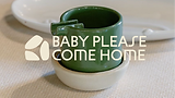
Baby Please
Come Home
SCOPE OF SERVICES
Branding, Logo Design, Visual Identity, Packaging Expereince
Baby Please Come Home (BPCH) is a homeware brand rooted in craft, materiality and thoughtful living. It transforms everyday household objects into pieces that feel intentional, functional and quietly beautiful. Working closely with local artisans, BPCH celebrates traditional techniques while presenting them through a contemporary lens.
They approached us to create a brand identity and packaging system that reflects this balance, elevating the ordinary, honouring the handmade, and turning daily rituals into meaningful moments.


Challenge
How do you create a brand and packaging experience for everyday objects that feels thoughtful and intentional, while still being playful and fun?
BPCH needed a system that celebrates material, form and function without taking itself too seriously, allowing the objects to shine while adding personality, warmth and a sense of delight.
Story
We began by closely studying the forms and proportions of the objects themselves. How they sit in the hand, how they occupy space, and how they’re used in everyday rituals. The process focused on integrating brand and object as one, allowing the identity to feel whimsical without overpowering the pieces, and ensuring the brand adds personality while the products remain at the centre.
The goal was to let the products lead the identity, finding visual cues within their shapes, curves and functions rather than imposing an external style.

System
The first step was the logo, designed as a balance between intention and play. The mark draws from soft, sculptural forms inspired by the objects themselves, giving it a sense of purpose and restraint. In contrast, the logotype introduces a more whimsical quality. Together, they elevate the everyday products to feel considered and premium, without taking
themselves too seriously.


The visual identity draws from the natural world. Earthy greens, soft blues, warm clays and gentle neutrals form a palette that feels intentional, calming and rooted in material expression. Each hue reflects a different product category creating clarity across the range while reinforcing the brand’s values of craft and thoughtful living.

Illustrations were designed to be pared back and sculptural, working quietly in service of the objects. Rather than compete with the products, they complement form, material and function, allowing each piece to take center stage as a piece of everyday art.

The packaging was crafted to mirror what the products embody: slowing down, drawing attention to what matters and highlighting material integrity. Layouts are clean framing each object without overwhelming it. Assigning distinct colour cues to categories makes the system intuitive to navigate while still feeling cohesive and elevated. Sculptural line drawings nod to the form and function of what’s inside, giving just enough detail to spark curiosity without clutter.


As part of the BPCH experience, we designed playful matchbooks as collectible freebies. With bold patterns and cheeky phrases that carry personality, they add an unexpected moment of delight. Small, unexpected, and full of character, much like the best corners of home. The first set, released with the brand’s inaugural drop, was titled First Fire ’24
.jpeg)

.jpeg)