Cook Ease
SCOPE OF SERVICES
Branding, Logo Design, Visual Identity, Packaging Expereince
Cookease is a meal-kit brand built around the idea of making home cooking effortless, joyful and accessible to everyone. Cookease blends convenience with warmth, removing the stress of planning and preparing while still giving customers the satisfaction of cooking a fresh, delicious meal.
They approached us to create a brand identity and packaging system that reflects this ease and clarity across every ingredient and touchpoint.


Challenge
How do you build a packaging experience that helps people cook with ease, making ingredients, steps and quantities effortless to follow, while also keeping the system practical for the team assembling each kit?
Cookease needed a clear, human-centred structure that simplifies both sides of the experience.
Story
We started by understanding how Cookease kits are packed and used, identifying where clarity was most needed for both the fulfilment team and the customer.
From there, we explored a bolder, more appetising visual direction, using strong colours and illustrations to bring energy into the cooking experience while keeping information
easy to scan.

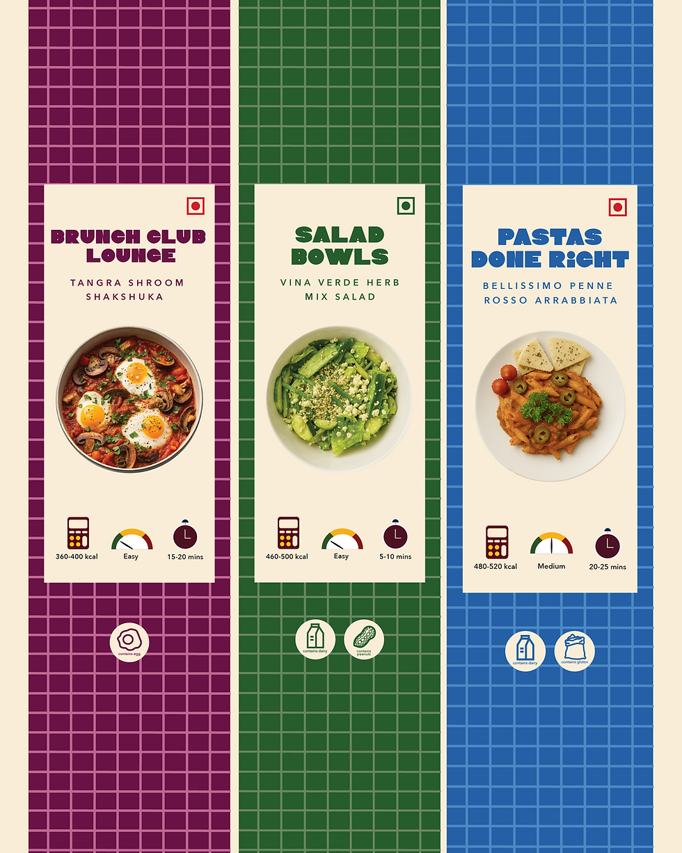
System
The system began with defining Cookease’s language, typography and illustration style. We developed a tone that feels confident and playful, paired with bold type and appetising illustrations to bring energy into the cooking experience and make the brand feel approachable rather
than instructional.


The Cookease logo pairs expressive typography with a simple illustrative gesture. By replacing the letter “O” with a bowl and spoon, the wordmark becomes a direct expression of the brand’s purpose—bringing cooking into the name itself. The result is a logo that feels playful yet considered, clear in intent and easy to recognise across packaging and digital touchpoints.


The visual identity was designed to feel confident and inviting, using expressive typography, bold colours and appetising illustrations. Together, these elements create a recognisable brand presence that feels energetic without overwhelming the experience.


Packaging, stickers and recipe cards were designed as one cohesive system. Clear hierarchy and repeatable layouts make ingredients and recipes easy to understand, while illustrations and colour cues add warmth and appetite appeal. Together, these elements guide both the fulfilment team and the customer through a smooth, intuitive cooking experience.