

RawRx
SCOPE OF SERVICES
Visual Identity, Packaging Expereince
RawRX is a nutraceutical brand built for people who want to feel better by relying on natural, food-based nutrition rather than synthetic fixes. Their products include food-based supplements like multivitamins, Omega-3, minerals and recovery essentials, all formulated to fit seamlessly into daily health routines.
They approached us to design a packaging and identity system that reflects this clean, natural positioning while elevating the experience of supplements beyond functional health cues to something more modern and considered.

.jpg)
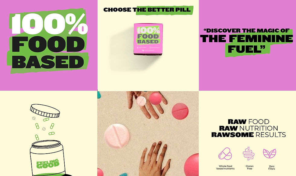
Challenge
How do you design packaging for a food-based supplement range that needs to communicate trust, clarity and natural efficacy, without reinforcing clinical or pharmaceutical conventions?
RawRX needed a system that feels transparent and contemporary, clearly communicating product benefit and usage while reinforcing their unique food-based proposition.
Story
Throughout the process, the client consistently emphasised the need to clearly highlight what matters – the product name and core proposition. We explored multiple directions and iterations, each aiming to bring more clarity and immediacy to the information on pack.
Eventually, the solution revealed itself. Instead of abstract emphasis, we used the visual language of a highlighter itself, turning a familiar, functional gesture into a design device. This allowed key information to stand out instantly, while giving RawRX a distinctive and purposeful visual identity.

System
The packaging system brings together a clear information hierarchy, a refined typographic system and purposeful visual cues to articulate product benefit quickly and confidently. Each SKU carries a structure that makes core details, such
as product name, category and usage suggestions – easy to locate and read at a glance, reducing cognitive load for
the consumer.

.jpg)


The visual language uses contemporary forms and restrained colour applications to signal quality and modernity, without defaulting to overly technical aesthetics. Graphic elements are used sparingly and with intention, creating visual rhythm while keeping focus on the essentials.


The system was crafted to scale across formats – bottles, boxes and multi-unit packs – ensuring consistency as the range grows.
The structure brings clarity to complex information, while the visual language adds a considered, contemporary presence that resonates with health-minded consumers. The design supports both everyday use and long-term brand recognition, giving RawRX
a coherent platform to grow
across products and categories.


.jpeg)

